In a world that moves fast, could the
answer to a decorating dilemma really be to slow down?
When you walk
into what you feel will be your forever home, you sometimes overlook certain unsavory elements and characteristics in pursuit of the ultimate goal: finding the
character, the history, the innate quality of “Yes…this is where we belong”
that every house has to have to take hold of your heart and not let go. When a home evokes this type of overwhelming
feeling, if you are someone like me, you have to run with it, even if the package
you treasure is currently wrapped up in a bow that may take quite a bit of
elbow grease to untie. Such was the case
with our dining room. Built in 1926, our
formal dining area appeared to be stuck in an era of Currier and Ives, lace,
and etched glass. Although these
elements were simply pieces of wallpaper, border, and lighting fixtures, they
presented an interesting challenge: how
do you separate age from elegance, and combine old and new in a way that
everyone gets along?
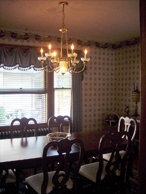
Our Dining Room, the Before Photo: While possibly historically accurate in its decor, it just didn’t work for our family’s needs
And of
course, for those of you who have been along this adventure with me thus far,
lies the reoccurring theme: How do we
respect the old but blend the new? A
house has history, and that history has to be respected, but how do we make
that history into something that works for a young and active family that might
not gel with crystal and repeating pineapple patterns? In this case, as opposed to changing course
completely, I found myself simplifying, slowing things down, and trying to make
meaningful selections instead of inundating the space with pattern.
Part of this
decision stemmed from the function of the room–it might be the setting for
Thanksgiving and Christmas feasts, but it also had to work for homework,
family game night, and piano practice.
On top of this laundry list of uses, it also served as a pass-through–the
direct line from the front door to the kitchen.
Add in transitional function with a wide entryway into the living room,
and all of a sudden it became an overwhelming space to nail down with one
design.
So in the
end, my goal was to make it a place for the eye to rest. Sometimes you need to look at a space and ask
yourself, “What annoys me the most in here?” and for me, in this instance, it
was all of the dull clutter the patterns created. Everything felt fussy and complicated, which
when you are using a space to move from one place to the next, or you need for
your preteen to concentrate on the latest math concept or this week’s piano
piece, simplifying and calming an area with color and a careful editing of
accessories and artwork makes your life a lot easier.
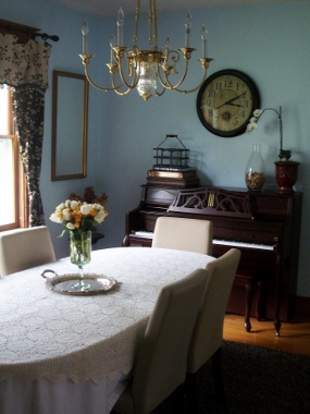
Our Dining Room, the After Photo: Simple changes involving color, pattern, and, for lack of a better term, “fussiness”, make a big difference. Above the piano an orchid I struggle to keep alive creates a great shape, a Homegoods glass jug holds memorable wine corks, and a great vintage milk bottle holder from Etsy stops the display from getting too serious
Once I knew
the direction I wanted to go in, it was a matter of making it work. The wallpaper of course had to come down, and
it inevitably put up a fight because plaster and old wallpaper glue are a tough
couple to separate (because of this, I went with a flat finish on my paint to hide the sins
involved with my wallpaper removal!).
When it came to color, I already had in mind a pale ice blue that
ironically I used in a bathroom in our previous home…an example of how
versatile color is for sure, because the reason it stuck in my head was because
I felt like the tiny bathroom it was in before always felt so calm and serene,
and that was the feeling I was looking for again, even though the function of
the room was a very different one.
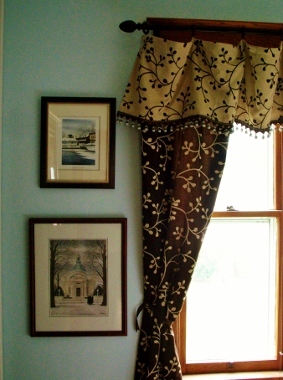
The pale blue and the earth tones in the drapery pattern work well together…even though there isn’t any blue in the fabric, the detail of the trim ties the two
Now of course
I couldn’t go completely without pattern, so it was introduced in the form of
curtains similar in style to the original room but updated in the contrast
berry pattern my mom and I found at a discount fabric warehouse in North
Carolina (ironically months before we even moved in!) and a great shag area rug
from Lowes that provided just the right amount of texture to make things feel
fresh. And the chandelier? Just removing the glass cups from the candle
sconces cleaned up the light fixture and made it compliment the rest of the
room instead of competing with it.
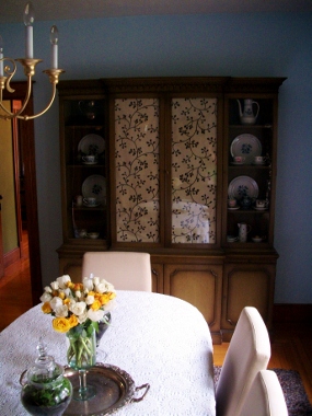
Sometimes what you don’t see is as important as what you do: by tacking the curtain fabric inside the middle doors of my husband’s grandmother’s antique hutch, I gained valuable storage space and continued to simplify the room. And don’t underestimate the power of fresh flowers… $14.00 spent at Price Chopper goes a long way to adding another dimension to your table!
So in the
end, the lesson here is that the answer to a question is not always the same
when it comes to decorating a perfectly imperfect old house. It’s like a recipe: a tablespoon of color here,
a fresh pattern there…a dash of framed artwork, a sprinkling of texture…depending
on the space ,the function, and the feel, the answer may change, but the vision
stays the same: creating a balance that works and customizes a space to the
family that live there!


