The Botticelli cherubs have to go…but what would welcome our
guests in its place??
When you acquire a 90-year old home, you inherit not only unique
charm and historic character, but…inevitably a few Amityville Horror design
choices as well. A plethora of brass
fixtures (chandeliers, faucets, knobs…), emerald green and ruby red wall-to-wall
carpet, and in the case of our entryway, circa 1983 wallpaper with a
coordinating border of chubby, naked cherubs that appear to be exchanging olive
branches, but make me feel anything but peaceful.

Exhibit A: the offending angels in question…I risked being struck by lightning, but there was no question that they were comin’ down
My personal opinion is that your front foyer wears a lot of
hats in the design of your home, and it can be a very tricky space to perfect.
You want that “wow” factor for sure, but it also needs to envelop each person
that walks through the door by being warm and comfortable; it inadvertently
introduces your guests to your style and hints of what is to come in the rest
of your home; and it has to play nice with all of the other rooms it feeds into…none
of which our not-so-little cupids were accomplishing.
Along with the heavenly angels, our entryway had a few other
obstacles to overcome, including a large radiator, thin but conspicuous piping
to the second floor in one corner, one of those brass chandeliers that was
literally hanging by a wire (hello fire hazard!), and walls that held two
interior doorways, our front door with stained glass transom and side windows, and
the main hall staircase. A lot going on for a small space to say the least!
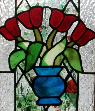
Although the stained glass surrounding our front door is very striking, it did take some strict color choices to make it work in the entryway…that or I just obsess over this stuff too much…
Well, safety first:
the chandelier had to go. Knowing
that I had to stretch my budget in order to continue to feed my decorating
addiction beyond this front hallway, I decided to go big box store for my light
fixture. I was pleasantly surprised while
strolling through the electrical aisles at Lowes to find a miniature ebony chandelier,
which I feel is a nod of respect to the age of the house, but also adds the
modern eclectic touch I strive for with its color (and my lovely husband added
a dimmer switch as well, because the last thing you want at the front door is
an interrogation room-style light fixture, that is unless you have houseguests who
drag out their threshold goodbyes way too
long…).
Next of course were my lovely voluptuous angels, and boy,
did they put up a fight. Four days of
wallpaper scoring, scraping, praying, swearing…definitely the topic of another
post, but let’s just say that I laughed, cried, and probably inhaled way too
much plaster dust, but finally completed my task. I would love to say that the walls were
smooth and perfect after the whole ordeal came to a close, but that of course
was not the case…not even close…and so I had to accept imperfection in its
finest form and hope that the flat finish on the paint I chose would cover a
multitude of messiness. Color choice was
another agonizing process, but in the end I chose a grass green that would get
along not only with the brightly colored stained glass surrounding the front
door, but also the blue, cream, and chocolate color schemes found in the neighboring
dining room and living room. As my
fellow blogger Laurel Ostiguy has pointed out, green can be a challenging color
to hone in on, so I sought out my good friend Martha for a little advisement. Love her or hate her, Martha Stewart may have
served time, but she sure knows her hues, and didn’t steer me wrong with a springy
green that looks great in any light, which is perfect for a space that changes
drastically from morning til night.
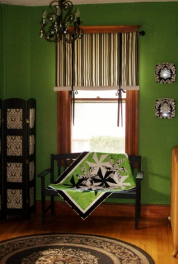
The After: A room that is crisp and bright. The rug is an indoor/outdoor selection that is thin enough to slide under the front door when it is open, and tough enough to stand up to whatever comes inside
And then of course the fun part–adding the fabric and
accessories that make a space belong specifically to you. I decided to balance the red, blue, and green
stained glass with an equally colorful, incredibly beautiful track painting
that was a housewarming gift from our best friends, but kept the rest of the
additions black and white in order to create contrast and avoid visual
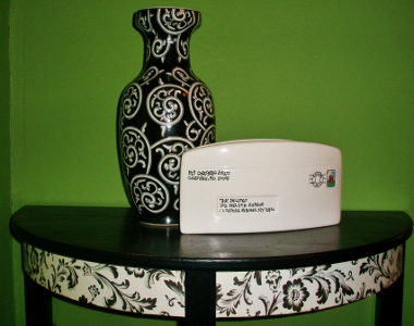
clutter. Bold stripes and modern damask
patterns pop off the green walls and I feel make a statement to our guests
without becoming overwhelming. And lots
of repurposing took place–the fabric for the striped window treatment was left
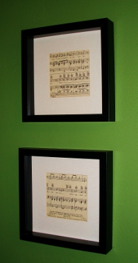
over from an upholstery project, the framed vintage sheet music once graced the
walls of our previous home, and the bench was brought in from the backyard and painted
black to fit under the window, a perfect place to put backpacks on top of and
boots and sneakers underneath. Not to
mention the gorgeous pinwheel quilt my mother made specifically for the space…all
I can say is that it helps to have talented people who love you!
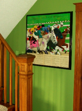
So the end result is one I’m proud of–a space that feels
classic yet fresh, and acts as an appetizer for the rest of our home. So long my chubby cherubs…a not-so-fond
farewell!

